Manek is an affable young man introduced in the second chapter of the book. He helps Gemmy set up his infamous science project.
Manek is a student at the University where Gemmy's parents work, and works part-time as a driver and minder for various University families. He ends up watching Gemmy most evenings after school and is the only person that Gemmy feels pays attention to him. Gemmy looks up to Manek and imitates him every chance he gets to try and seem more 'grown-up'.
I wanted the drawing of Manek to reflect the congenial nature of the character. As someone who looked after children in my teens it takes a lot of humour to keep kids entertained and to get them to listen to you when you're not their parent. Above all, you have to be their friends, and I wanted Manek to look like the type of guy who would be able to earn the trust of a very cynical young Gemmy.
Enjoy!
‽
Showing posts with label Book 1. Show all posts
Tuesday, 6 August 2013
Saturday, 20 July 2013
Rock 'em sock 'em robots
Half the fun of drawing the sentinels was getting to draw sketches of cool weapons and figure out how their mechanical skeletons could potentially work. I remember spending hours when I was younger filling sketchbooks full of cool gadget ideas. I desperately wanted to be an engineer (then I realised I hated maths).
All I have to say is: Retractable arm canon. Rotating arsenal of three different weapons - Plasma bolts, stun cable and incapacitating foam. (I realise they probably wouldn't need a laser sight as their robots and could probably target better than a human).
The sentinels are described in the book as:
"The sentinels were eerie looking bots. Each the height of Maester Arms and equally broad. Their onyxian frames were humanec but entirely devoid of features; just sleek metal bodies with eyeless orbs atop their shoulders. Their only defining feature was a golden symbol at the centre of their chest. Gemmy recognised it instantly as the ‘all knowing eye’ of Black Star Labs."
Anywho, here's how the sentinels measure up against humans:
Enjoy!
‽
Sunday, 14 July 2013
Introducing Semjanine Grimm
So, I've decided that all the final drawings will be portrait style. I want there to be consistency when flipping through the book.
I've done a new drawing of Sem. I really like this one. She's a rough and tumble girl. She's supposed to be as able as any man on a playing field so she's not meant to be dainty looking, and that's what I like most about her.
Enjoy!
‽
I've done a new drawing of Sem. I really like this one. She's a rough and tumble girl. She's supposed to be as able as any man on a playing field so she's not meant to be dainty looking, and that's what I like most about her.
![]() |
Sem - pencil on paper |
![]() |
Sem - digital render |
‽
Saturday, 6 July 2013
Saturday setting
What did you do with your Saturday?
I spent mine typesetting. I've been working on the glyphs and chapter headings so I thought the best way to see how they looked was to actually set a page.
I know in a modern printed book they would never use a ragged edged. But, I find doing all the kerning and line space adjustment to fit it all together like a puzzle to be relaxing.
I'm not convinced of using the streaky ink look. But, I think the motif works quite well for a start. I used 'Bodoni' to set the text.
Here are the other glyphs.
What do you think?
Enjoy!
‽
Thursday, 4 July 2013
unCOVERED
First thing I had to do was work out the font for the titles - a series needs a style. I wanted a bold glyphic font as the various glyphs from the world feature in the book (and the 'O' in 'Project' is the glyph for the project). The font I found, AmazDooM, is quite strong and imposing which conveys the ominous nature of the project. I added a touch of perspective to give it the epic feeling.
I rendered a direct translation of my first concept.
I'm not 100% sold but I feel this is closer to something that would stand out on a shelf compared to the others. It's more 'comic booky' than I'd prefer, but I suppose, it's what I'd be attracted to if I saw it on a Waterstone's shelf.
What do you think?
Enjoy!
‽
I rendered a direct translation of my first concept.
I didn't feel like the star was totally necessary and the drama as the background was being lost so I tried the cover without the star.
I wasn't enthralled by this concept once I did some full colour mock-ups though. It's nice and works really well as a poster but not really as a book cover. It's a bit muddy and is missing an aspect of the dramatic - much sharper, high simple colour contrast that you can spot amongst a sea of other brightly coloured books. I did some more sketches but kept coming back to my original concept of just the star and a lightning bolt. But, I realised what I was missing from it was colour.
So, I applied the concept of the reversed-out star combined with my original concept and came up with something that I really like.
What do you think?
Enjoy!
‽
Friday, 28 June 2013
DisCOVER
My first cover ideas: These covers weren't really right. I like them a lot, but I don't think any are right.
I follow Tony DiTerlizzi's blog and read his entry on how he develops covers for the Wondla series. It finally clicked exactly why my original ideas didn't really work. They weren't terribly evocative of the sentiments and atmosphere of the book.
Then I spent some time looking through my favourite book covers from young adult sciencefiction. I particularly looked at the series that I started reading because I was drawn to the covers.
I distilled some easy principles that all of them shared for cover layout:
So, I sat down and did some thinking about what the emotional feelings of the book are. I realised the major themes are:
Here's my first crack at a cover for the book. I really like the feeling. I'm not sure if the landscape of the Vasts is the right one, but it's heading in the right direction. Now to start finalising it and playing with fonts!!! Wooo!!!!
What do you think?
‽
I follow Tony DiTerlizzi's blog and read his entry on how he develops covers for the Wondla series. It finally clicked exactly why my original ideas didn't really work. They weren't terribly evocative of the sentiments and atmosphere of the book.
Then I spent some time looking through my favourite book covers from young adult sciencefiction. I particularly looked at the series that I started reading because I was drawn to the covers.
![]() |
Three of my favourites |
- ALL CAPS (which I instinctively hate but it's par for the course)
- Centred text
- Large central image
- Colourful
- Creates a mood
- Two fonts - Three if you count a stylised title
So, I sat down and did some thinking about what the emotional feelings of the book are. I realised the major themes are:
- Self discovery
- Feeling out of place - outside looking in
- Bravery
- A gathering storm
![]() |
Some initial sketches - still not right |
Here's my first crack at a cover for the book. I really like the feeling. I'm not sure if the landscape of the Vasts is the right one, but it's heading in the right direction. Now to start finalising it and playing with fonts!!! Wooo!!!!
![]() |
First sketch of cover |
‽
Monday, 17 June 2013
Arm yourself
On the go with the second round of edits and have had a wash of inspiration for drawings. I've even started powering through the outline of Book 2.
I really like this drawing. He's turned out looking a bit like Bruce Willis and Mills Lane love child. I think he's coming out looking the right combination of hard man with a horror behind the eyes.
Enjoy!
‽
![]() |
Maester Arms - pencil on paper |
I really like this drawing. He's turned out looking a bit like Bruce Willis and Mills Lane love child. I think he's coming out looking the right combination of hard man with a horror behind the eyes.
Enjoy!
‽
Wednesday, 5 June 2013
"B" is for...
'Book' 'Birthday' 'Brilliant'. I had a wee celeBration this weekend to commemorate two things.
1) Ryan would have been 31 on the 30th of June; and
2) I finished the first round of copy edits on the book.
I'm going to do another edit to massage some of the text. But as far as copy goes it should read like a proper novel. All commas and punctuation in it's proper place. Then it will be finishing drawings and summer break then... going for publishing!!
It's always good to celebrate the milestones of life and work. Thanks to my mates for coming out to celebrate life w me and for the awesome card... and chocolates.
Thursday, 2 May 2013
And so the big edit begins
This is it! The final push!
I've been sitting idle a while working on other projects, doing lots of reading, drawing, making origami. I think of it less as procrastination and more as "inspiration gathering". And now the time has come, I'm going to do my final edit of Book 1.
I got a bit stumped doing the outline of Book 2 and I think, as with writing the first book, going back might be the best way to go forward.
I'm meeting with my mate Pat next week to do a final map of Arbea. And, I'll hopefully be enlisting the help of another friend to rationalise my pictographs.
Then, at the end of the month, I'll be cat sitting for a friend. This means I'll be living away from my computer. I'm going to take that time to turn Gareth's flat into my writing studio and spend my evenings writing (by hand) and thrashing out the last bits of Arbea. Hopefully his cat, Martha, won't mind and maybe I'll find some unforeseen inspiration for the Rh'ezans. :)
Wish me luck!!
‽
Friday, 5 April 2013
Project Emersus: Mission statement
What is Project Emersus? Well, you'll have to read the book to find out a bit more.
But, I've decided that in the final draft of the book there will be a prologue that will help set the mood.
So, here's my first whack at the opening plate for Book 1
Enjoy!
‽
But, I've decided that in the final draft of the book there will be a prologue that will help set the mood.
So, here's my first whack at the opening plate for Book 1
Enjoy!
‽
Wednesday, 20 March 2013
All wrapped up in orange
So, as I'm starting on final edits I'm trying to think of a cover, thinking about the the book with a marketing eye. I wanted to start with the cover because, as with my writing process, the words and the images go hand in hand. One of the things that struck me right away was that the title wasn't right. While "The Mighty Orange-Peel" is hilarious and understandable to me, it isn't the most engaging title from a marketing perspective. So began my adventures in coming up with a new title.

I trolled through the works of one of my favourite book designers, Chip Kidd, to discover what his philosophy on books is. From what I gathered, book covers are a metaphor for the major themes of the book. And, really, the biggest theme in the book is Gemmy's 'otherness'. He feels strange. And over the course of the book his idea of who he is gets a jolt. So, I came up with the title "Kick Start" and did some quick mock ups, a la, Chip Kidd.
I love these covers, but I don't really think they reflect the genre or the feeling and sentiment of the book.
Next I had a hard look at the series name, "The Strange Chronicles". While it's a bit on the nose about how Gemmy feels about himself, overall, it's not what the story itself is about. Also, thinking like a business man, calling your own series "strange" does not give the best first impression. Ultimately the whole saga is about the process of Gemmy finding out who he is and what the heck all of the things that have been done to him mean. So, I titled the series: "The Emersus Project". You'll have to read it to understand that one.
Project Emersus
Then, I had a chat with a mate who also enjoys fantasy and he gave me some insight about what draws him in with a title. It has to have a hint of mystery and a touch of darkness. So, I had another wee think. Each of the stories I have lined up in my head would then need to be focussed through the lens of each being a phase of the Emersus project. The first phase being the work of Black Star Lab and what it has to do with Gemmy's family. And then it was like "Mystery - star, Darkness - black, other worldliness - black star" BOOM!
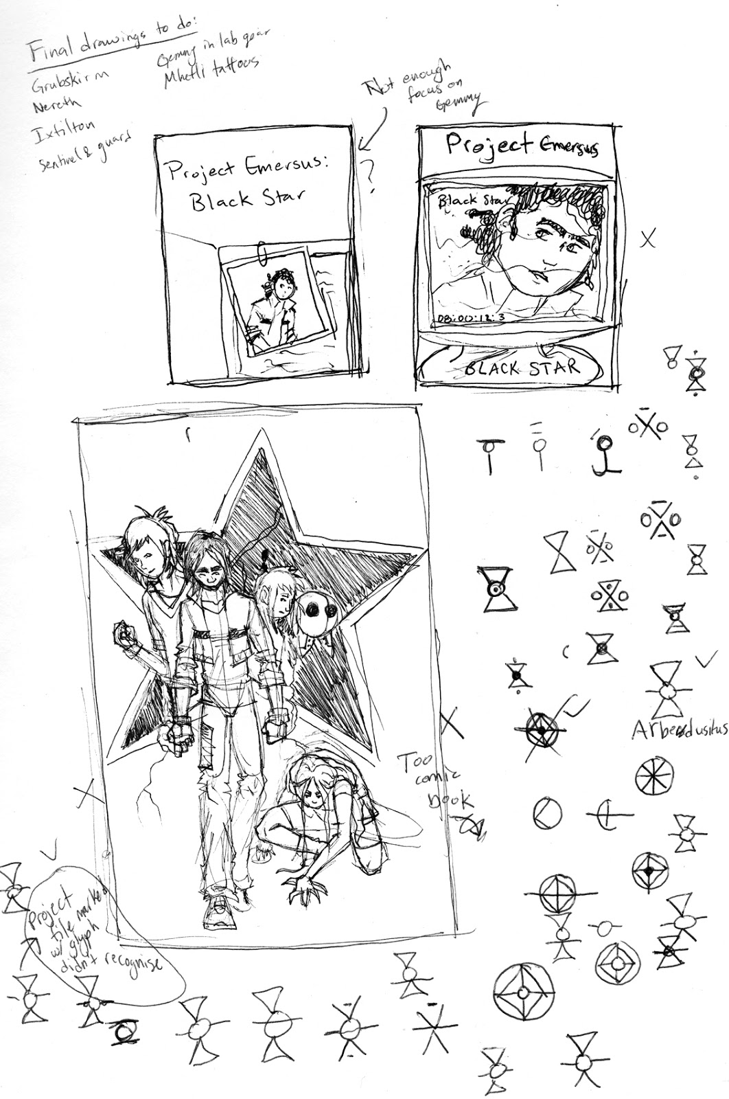
Here are some early sketches of a cover for my book "Project Emersus: Book 1 - Black Star"
I'm probably going to whip up a few other ideas but so far I like the starkness and slight feeling of doom of this draft. I know I've struck the right chord when I'm looking at an image and I hold my breath. That's how I feel when I look at the plain black and white one. What do y'all think?
I've done a few more that I don't really like them. The two above are cool but too sci-fi for my liking. And the last is just too banal. Any other ideas?
Enjoy!
‽
Labels:
Black Star,
Book 1,
Chip Kidd,
Cover,
Illustration,
Project Emersus
Wednesday, 13 March 2013
Final drawings: Pencil perfect
I'm embarking on a final edit of Book 1 this spring. And as I do, I realised I need to do some final drawings. There are a few that are done, like those of Gemmy when he's transformed and Gravander. These characters were so clear in my mind that they came out on paper right away. But there are some characters that need to be defined. For example, I've never quite had Nereth's face in my head. And some that just need a proper portrait done like Sem who is clear in my head I've just not done her justice in drawing (So far the only one that I've liked I did in 2010. Might just redraft it into a final).
The final drawings in the book I think will be the simple black and white pencil drawings. I like the dreamy quality of pencil on paper. It allows your brain to fill in the fantastic while suggesting reality.
For a starter, I've redone my sketch of Gemmy in his school uniform. There's something about the original that I like as I think in the new version he's a bit too gawky. What do you think?
Enjoy!
‽
![]() |
Gemmy uniform, 2011 |
![]() |
Gemmy redrawn, 2013 |
![]() |
Gemmy... finally - pencil on paper |
Here's a new drawing of the girls as discovered in the lab. I like the concept of the two standing together, Lauta, brash and ready, protecting yet teaming up with Ilä. But I will definitely need to rethink it. Small inconsistency, they don't get their haircuts until well after they're out of the lab and would not be wearing their suits. They both have long matted hair at the start. Below is what the drawing should really be. I like Lauta's ferocity in the second also, her proportions are better (FYI - her body is meant to look slightly distended. It's one of her physical 'defects').
![]() |
Ilä and Lauta |
![]() |
The girls as first encountered - Pencil on paper |
Subscribe to:
Posts (Atom)