So, I've finally come up with a design that I'm pretty happy with.
It's taken several iterations. I had particular trouble with the band that will sit at the bottom. It was more trouble trying to decide how much detail and what elements would be incorporated. But, I fell back on the old troupe, 'Less is more'.
The thing that I really wanted to get in there was the wave patter that you see bordering the triskelion. I've seen it as part of larger tattoo motifs in the circle around the shoulder or the arm. But with the complexity of the eagle and unicorn it just made the band at the bottom look messy (see earlier drafts)
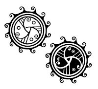
 On the left hand version I've turned the figures inward to more closely resemble the Scottish crests I've seen with unicorns gallantly framing a shield. I'm undecided on which triskelion to get (the outline version or the knockout black version). I think the black version is a bit too much given there's a lot in the rest of the tattoo already. However, as a standalone tattoo I think the black is much more eye-catching and fits in more with others that I have.
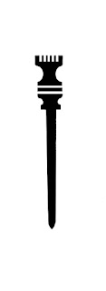
I also want to get a stylus tattooed on my right forearm. A stylus is an ancient writing tool but is also the symbol for the muse Calliope who is my muse (and also the name of my good friend's wee bairn! She can borrow my design when she's older.) I'm dithering between slghtly more complext designs and something simple.
I'm a bit worried. I don't really want a tattoo that will be visible when I'm wearing short sleeves. Plus, I don't want it to be mistaken for a knife (I also realise it looks a bit like a wand from Harry Potter). The more complex designs look less weapony. And I added a fountain pen nib to highlight its use as a writing utensil. I think the one on the right is what I'm going to go for. It also uses one of the runes from the Emersus Project series. It's the glyph of Arbedusitus - a being with the ultimate power to bring peace to the world. I guess the pen really is mightier than the sword! I'm going to let the idea sit for a while. But, I have a very strong feeling it's going to happen anyway!Hope you enjoy!
‽
Buy Book 1, 'Black Star' on Amazon in the UK and US
Check out Themo on Twitter and Facebook


