Showing posts with label Cover. Show all posts

Friday, 19 February 2016

Spirit Shear unCovered

Themo H Peel - Spirit Shear book coverWith the launch of 'Spirit Shear' less than six weeks away I realised it was time to get a move on and get book two's cover ready.

I wanted it to be in the same style as the first book, Black Star. I think the stark silohuette of Gemmy against a bright background was quite appealing still.

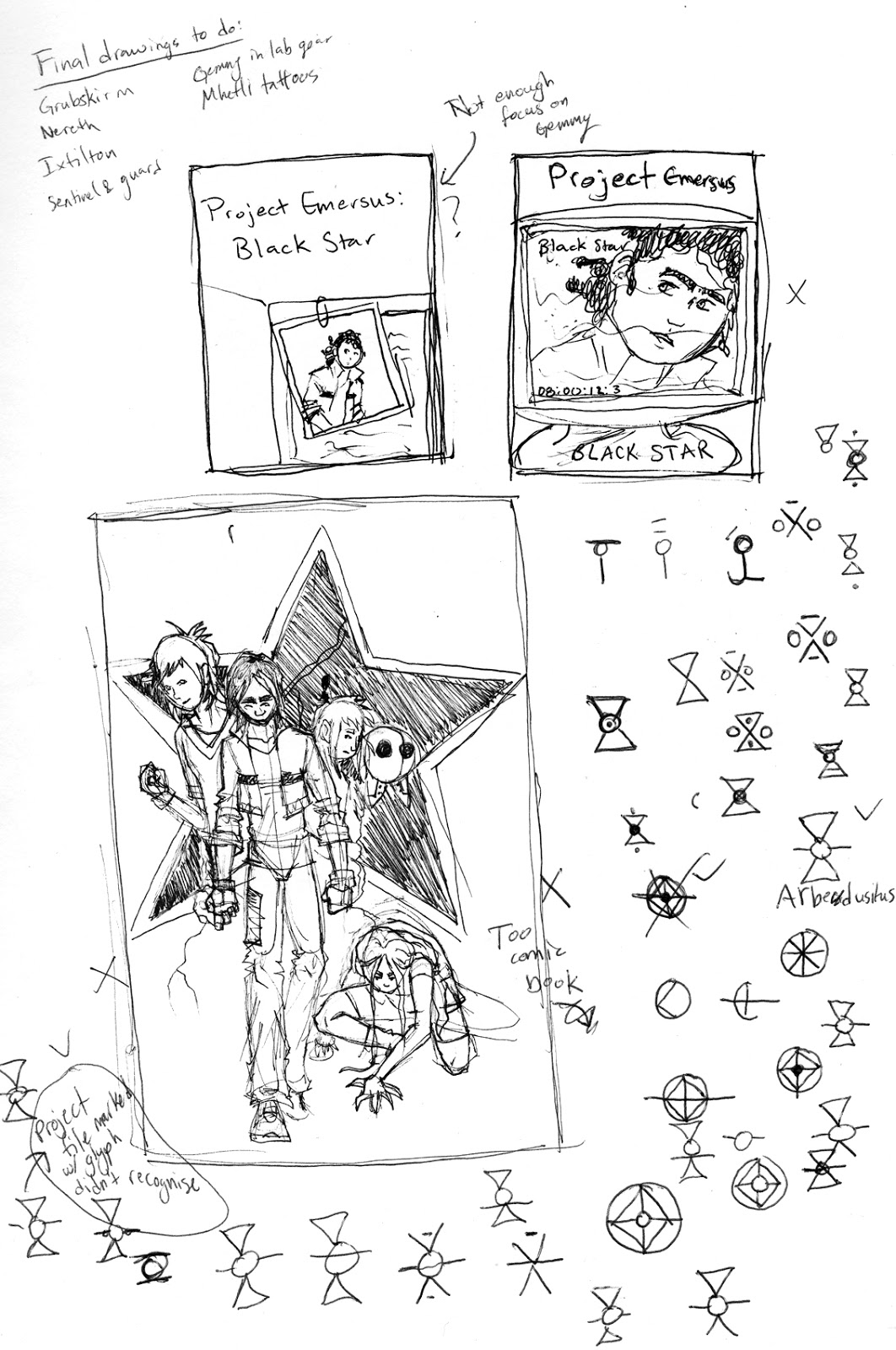
Original concept art for Book 2

Themo H Peel - Black Star book cover
Book 1's cover
I think this is a nice evolution from the first book's cover. The figure of Gemmy is much stronger in stance and looks, ready for action. One book 1, 'Black Star's', cover I deliberately wanted him to look startled by the lightning, frightened by the power that was coming to him. However, now the power is literally in Gemmy's hands. He's accepting himself and is braced for what's coming next.

On the new cover he's also dressed in the garb of Rheza, a hint at some of what's to come in this story. 'Spirit Shear' is definitely more of an adventure story than the first and the cover reflects that, a spear in Gemmy's hand and a crazy Rhe'zan cloak on his shoulders. Also, we're not just glimpsing the figure through the knock out of the rune for Spirit Shear (aka magic). Gemmy is bursting out of the frame, his spear sitting above the edges coming out at us. He's not prey any more.

However, I've never been totally happy with the how the title 'Emersus Project' looked. So, I've spent more time trying to get the affect of the titles and the contrast of the design right. The background is not a solid black making the title stand out more and ditching the need for a glow behind the lettering. I've also stylised the 'Emersus Project' lettering a bit more to help match the inksplatter look of the knockout shapes. I've been planning to do a 'Black Star 2.0' at some point and definitely think a revamping of the cover as well as the illustrations and text is in order.

Themo H Peel - Gemmy on Arthur Seat EdinburghThemo H Peel - Arthur Seat Edinburgh ScotlandI also worked on the frontispiece this week. I won't give it all away but I ended up using some imagery from my drafts of the first cover. Never throw out anything!! I love this original image because it's a drawn version of a picture that I absolutely love of me standing on top of Arthur Seat in Edinburgh. That moment standing above the city was a pivotal moment in my life and this version of the cover still makes me smile. So glad I'm able to use it in a new way.

Check out the 'Black Star' cover sketches and final concept art.

Hope you enjoy!


Buy Book 1, 'Black Star' on Amazon in the UK and US
Check out Themo on Twitter and Facebook

Thursday, 4 July 2013

unCOVERED

First thing I had to do was work out the font for the titles - a series needs a style. I wanted a bold glyphic font as the various glyphs from the world feature in the book (and the 'O' in 'Project' is the glyph for the project). The font I found, AmazDooM, is quite strong and imposing which conveys the ominous nature of the project. I added a touch of perspective to give it the epic feeling.

I rendered a direct translation of my first concept.

 
I didn't feel like the star was totally necessary and the drama as the background was being lost so I tried the cover without the star.

I wasn't enthralled by this concept once I did some full colour mock-ups though. It's nice and works really well as a poster but not really as a book cover. It's a bit muddy and is missing an aspect of the dramatic - much sharper, high simple colour contrast that you can spot amongst a sea of other brightly coloured books. I did some more sketches but kept coming back to my original concept of just the star and a lightning bolt. But, I realised what I was missing from it was colour. 

So, I applied the concept of the reversed-out star combined with my original concept and came up with something that I really like. 

I'm not 100% sold but I feel this is closer to something that would stand out on a shelf compared to the others. It's more 'comic booky' than I'd prefer, but I suppose, it's what I'd be attracted to if I saw it on a Waterstone's shelf.

What do you think?

Enjoy!

Friday, 28 June 2013

DisCOVER

My first cover ideas: These covers weren't really right. I like them a lot, but I don't think any are right.

I follow Tony DiTerlizzi's blog and read his entry on how he develops covers for the Wondla series. It finally clicked exactly why my original ideas didn't really work. They weren't terribly evocative of the sentiments and atmosphere of the book.

Then I spent some time looking through my favourite book covers from young adult sciencefiction. I particularly looked at the series that I started reading because I was drawn to the covers.

Three of my favourites
I distilled some easy principles that all of them shared for cover layout:

  • ALL CAPS (which I instinctively hate but it's par for the course)
  • Centred text
  • Large central image
  • Colourful
  • Creates a mood
  • Two fonts - Three if you count a stylised title

So, I sat down and did some thinking about what the emotional feelings of the book are. I realised the major themes are:

  • Self discovery
  • Feeling out of place - outside looking in
  • Bravery
  • A gathering storm

Some initial sketches - still not right

Here's my first crack at a cover for the book. I really like the feeling. I'm not sure if the landscape of the Vasts is the right one, but it's heading in the right direction. Now to start finalising it and playing with fonts!!! Wooo!!!!
First sketch of cover
What do you think?

Wednesday, 20 March 2013

All wrapped up in orange

So, as I'm starting on final edits I'm trying to think of a cover, thinking about the the book with a marketing eye. I wanted to start with the cover because, as with my writing process, the words and the images go hand in hand. One of the things that struck me right away was that the title wasn't right. While "The Mighty Orange-Peel" is hilarious and understandable to me, it isn't the most engaging title from a marketing perspective. So began my adventures in coming up with a new title. 


I trolled through the works of one of my favourite book designers, Chip Kidd, to discover what his philosophy on books is. From what I gathered, book covers are a metaphor for the major themes of the book. And, really, the biggest theme in the book is Gemmy's 'otherness'. He feels strange. And over the course of the book his idea of who he is gets a jolt. So, I came up with the title "Kick Start" and did some quick mock ups, a la, Chip Kidd.

I love these covers, but I don't really think they reflect the genre or the feeling and sentiment of the book.


Next I had a hard look at the series name, "The Strange Chronicles". While it's a bit on the nose about how Gemmy feels about himself, overall, it's not what the story itself is about. Also, thinking like a business man, calling your own series "strange" does not give the best first impression. Ultimately the whole saga is about the process of Gemmy finding out who he is and what the heck all of the things that have been done to him mean. So, I titled the series: "The Emersus Project". You'll have to read it to understand that one.

Project Emersus

Then, I had a chat with a mate who also enjoys fantasy and he gave me some insight about what draws him in with a title. It has to have a hint of mystery and a touch of darkness. So, I had another wee think. Each of the stories I have lined up in my head would then need to be focussed through the lens of each being a phase of the Emersus project. The first phase being the work of Black Star Lab and what it has to do with Gemmy's family. And then it was like "Mystery - star, Darkness - black, other worldliness - black star" BOOM!

Here are some early sketches of a cover for my book "Project Emersus: Book 1 - Black Star"


I'm probably going to whip up a few other ideas but so far I like the starkness and slight feeling of doom of this draft. I know I've struck the right chord when I'm looking at an image and I hold my breath. That's how I feel when I look at the plain black and white one. What do y'all think?


I've done a few more that I don't really like them. The two above are cool but too sci-fi for my liking. And the last is just too banal. Any other ideas?


Enjoy!