
 |
| developing motifs for the book |
Typography design takes lots of exploration. I spent a while exploring the form of Celtic runes and experimenting with creating a 'runic' sort of font. You want any book to have a memorable font. And, the greatest series, all have their own unique type-face that is identifiable at a glance. Think of Harry Potter, Marvel Comics and (I hate to say it) Twilight.
The thing about these fonts is they are all hand drawn which automatically makes them unique. It create something special when you know a font has been hand crafted specifically for that title.
 |
| The earliest version of the font |
Early drafts came out looking a bit too literal. I've seen similar fonts and while stylistically their inspiration is very obvious, readability is poor. And, for any book, especially for young people, you want them to be able to read the title without any difficulty.
From these drafts I stripped back some of the 'rune' elements, primarily the unrelenting straight lines. Allowing the forms to curve made the text look less archaic. What came out I thought looked quite classy but was still a bit too modern.
 |
| Getting smoother |
 |
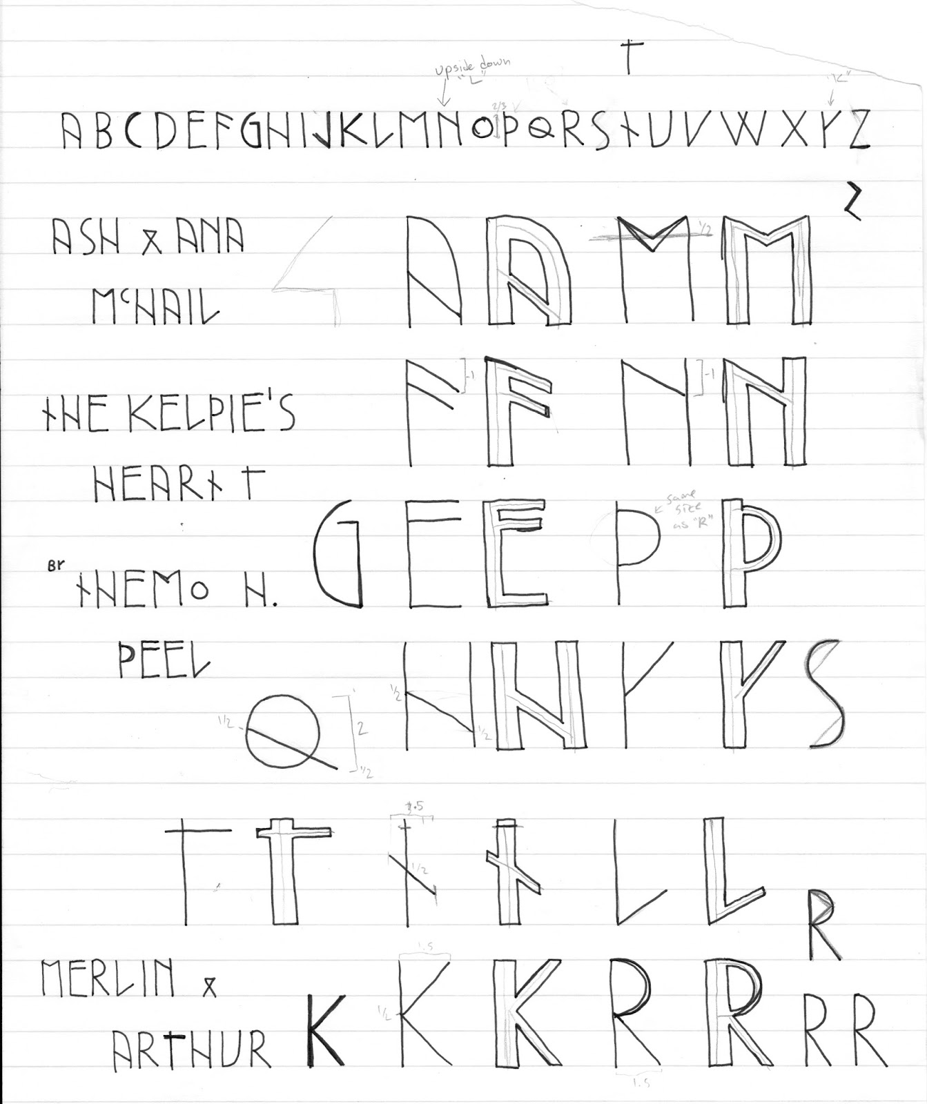
| measuring out on graph paper |
My first cover idea will feature Pictish filagree and figures as a frame. The letters need to stand out in an environment of intricate swoops and swirls without jarring against. So, while the sans-serif look is more true to the rune idea, it doesn't totally fit the aesthetic.

 |
| practice practice practice |
 |
| cover idea and lettering test |
What it turned out was a more organic serif version of my initial ideas. While it's come a way from the blunt edged runes, the font maintains the odd runic proportions with sloped descenders and unique angles. I particularly like how the 45degree angles on the 'K' intersect with the vertical line in a way that cuts off part of the line thickness.
So, that's how I came to this cover idea's lettering. And you might have guessed the new title already! I'll do another post on how I came up with the new title later on and I'll post cover ideas as I start churning them out. The book is away to be proof read and I'm getting more feedback from a friend who's an editor. So, I'm fairly excited/nervous about this next phase of my publishing journey.
 |
| testing out the lettering |
I know that these ideas might all totally change when I have an agent. But, it's nice to keep my creative juices occupied while I'm on the look for that agent who will help me get to the next level!
Keep growing and keep going!
‽
Buy 'Black Star' or 'Spirit Shear' on Amazon in the UK and US
Check out Themo on Twitter and Facebook
No comments:
Post a Comment