Friday, 29 September 2017

New Tattoo - unieaglecorn

Behold! The Unieaglecorn tattoo!!!
Themo H Peel - Pictish eagle and unicorn tattoo
The Peel family crest if ever there was one!
I just got inked with this bad boy and I'm so pleased with how it's turned out. There have been a few changes to the design since it's first incarnation.

The original design
Themo H Peel - Pictish triskelion band tattooFirst the band is different. I had a chat with Erik, my tattoo artist and realised that while the geometric pattern was indeed Pictish, it's not instantly recognisable as such. People tend to associate swirling knots and circles with Pictish style.

So I redesigned the band with a more organic spirals. But, I wanted to maintain a structured pattern. So, I brought the idea of the triskelion into the band and each swirl intersects with two others to form a triskelion. It gives the band the beautiful flowing shape but also keeps the mathematical beauty of triangles.

The second update is to the unicorn. This was partially inspired by the work I did on my cover for The Kelpie's Heart. I tidied up some of the lines. Also, the original Celtic knot in the unicorn's tail had some sharp edges that I got rid of. I won't lie, I added them because I wanted to make the unicorn look butch! LOL But, it just looked messy and cluttered.

Keeping the look true to Pictish style was far more important. And, I like the flourish and swirl at the end of the tail now. It also has some Pictish war paint across it's face giving it a tribal look. I think it makes it a much more complete figure and it relates better to the eagle.

I think it all hangs together much better and, as it's permanent, I think it fits in well with my others and it really means a lot to me. I'm so happy with the way it turned out. And, even better, my family and friends gave me money for my birthday to get it. So, it's kind of completion of a journey for me. *sniff* Now, fly my unieaglecorn! Fly!!

If you're curious, here's how the original idea came together.

Hope you enjoy!
‽

Buy 'Black Star' or 'Spirit Shear' on Amazon in the UK and US
Check out Themo on Twitter and Facebook

Saturday, 16 September 2017

The Kelpie's stripes

I had a few other ideas for the cover of The Kelpie's Heart that I've now had a chance to take out of sketches and into a reality. They're not necessarily right for the children's market but I definitely enjoyed making the art.
Themo H Peel - Kelpie

Themo H Peel - The Kelpie's Heart Cover 2The first is one of my favourite scenes from the book and of Scotland. Just an image of the rolling hills in Scotland on a moonlit night. The wee silver pendent with a celtic knot heart motif engraved in it wending its way through the hillside like a silvery river. There's the faintest watermark of an important rune from the book just under it. Giving a bit more depth to the blackness. It's a lovely image but it's a bit too Twilight Saga for me.

The next is just a fun image. I don't think it would work as a cover at all. I just love the flat panel drawings of the characters. The Kelpie is my favourite but Ash and Ana are dynamite as well. The stylised swirls in knock out really create fun silhouette type figures. I also love Eopa's nasty little tongue. Just a bit of preview of her real self.

Themo H Peel - The Kelpie's Heart Cover 3I think I cracked it with the first cover, personally. It's still my favourite. But there's definitely something alluring about the image of just the kelpie's face on the silvery sea-green back drop. What do you think?

Hope you enjoy!
‽

Buy 'Black Star' or 'Spirit Shear' on Amazon in the UK and US
Check out Themo on Twitter and Facebook

Beginning Book 3 - Emersus project

So, The Kelpie's Heart has flown the nest. It's as well drafted as it can be and a friend is having another proof of it. I'm sending out agent queries as well.

While I sit on my hands and wait for the rejection letters to roll in, I need to keep my head and hands busy. I started the outline for the Emersus Project book three ages ago. And now I'm making my first crack at a draft. I might even do it during NaNoWriMo this November.

As I ramp up to the writing I'm doing some drawings of the gang when we pick up with them in Book 3.
The gang - ballpoint pen and colour pencil

Gemmy has turned 16 and starting his last year of school with Sem, who is a year older. She's kept her long golden locks from the end of book 2. But, true to herself, she's died a streak of her hair bright pink. And, sticking with function over form, has cut a fringe in the front so it doesn't get in the way of her playing sparrein.

Mhteli is back and as lethal as ever. He's embracing his Rhe'zan side and has let the top of his hair grow long with close cut sides. It adds to him looking every bit as ferocious as he is.

I'm so happy to see these guys again and I feel like I'm catching up with old friends as their faces come into view.

This October I'm going to reread and edit books one and two into a master version. I've learned so much since writing that first novel and I want to go back and give it the benefit of my experience. So, when book 3 comes out, I want to publish a remastered version of 1 & 2 with new illustrations for the first.

Whoop! So, what this space folks! More drawings of Gemmy and crew coming your way. And keep your flippers crossed for The Kelpie's Hearts as it wings its way to agents!

Hope you enjoy!
‽

Buy 'Black Star' or 'Spirit Shear' on Amazon in the UK and US
Check out Themo on Twitter and Facebook

Sunday, 30 July 2017

Covering Celtic Mythology

I've been playing around with fonts for the cover with the new title. I've come up with a first cover idea that really works with the concept.

My original ideas for the font just didn't work with the Pictish motif. Turns out that a more modern looking black type font juxtaposed against the traditional swirls really made a difference. I created a modified version of another font to create the type. So, I stripped it back to an type only cover and worked up from there. It really helped clarify the problems I was having with the typography.

Here's a rough draft of my first cover idea. Of all the Celtic gods and mythological creatures the Kelpie is by far my favourite. It's exciting to have it front and centre in the title and as an image.


I stylised it in the same way that the horse and kelpie are depicted in Pictish carvings particularly the Hilton of Cadboll Stone which is in the National Museum of Scotland. I've been enchanted with the stone ever since I first saw the Pictish stones there. I didn't want to make the cover to literally reference the stone because, as I said in my previous post, I want the book to look like a book. But I definitely needed to make reference to my inspiration.

I'm going to try and go to other places with the cover. I want to go all out with the Celitic Mythology angle adding in even more obscure creatures and the main characters, Ash and Ana, in some kind of scene. But it be good to do some all type versions and something completely left field.

Hope you like!

Keep growing and keep going!
‽

Buy 'Black Star' or 'Spirit Shear' on Amazon in the UK and US
Check out Themo on Twitter and Facebook

Monday, 17 July 2017

The font of all magic

Getting excited for the book. I've had some very good advice from a friend and am rethinking the title. To try and keep me motivated I've also been working on some ideas for the cover.

developing motifs for the book
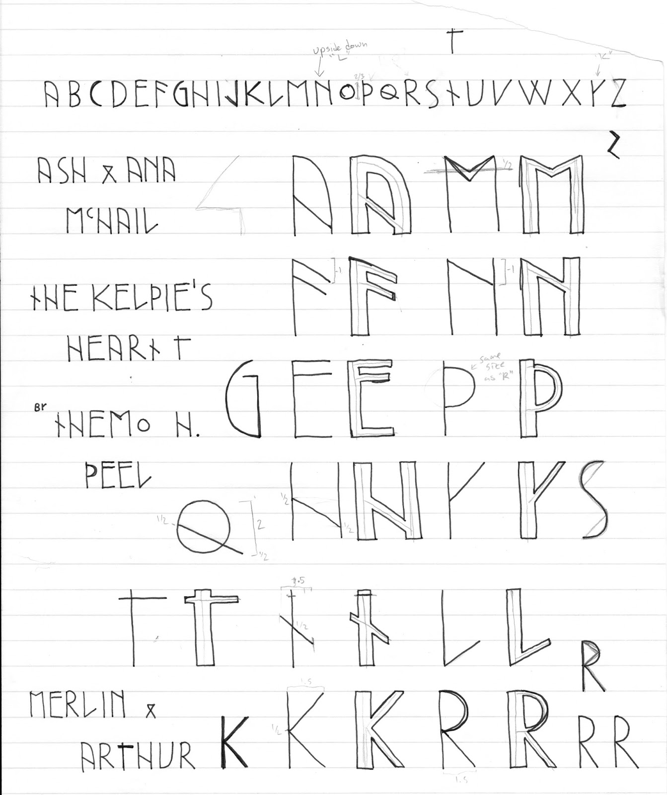
I wanted to a typeface that would be suitable for the book's subject - Celtic Magic.

Typography design takes lots of exploration. I spent a while exploring the form of Celtic runes and experimenting with creating a 'runic' sort of font. You want any book to have a memorable font. And, the greatest series, all have their own unique type-face that is identifiable at a glance. Think of Harry Potter, Marvel Comics and (I hate to say it) Twilight.

The thing about these fonts is they are all hand drawn which automatically makes them unique. It create something special when you know a font has been hand crafted specifically for that title.

The earliest version of the font
Early drafts came out looking a bit too literal. I've seen similar fonts and while stylistically their inspiration is very obvious, readability is poor. And, for any book, especially for young people, you want them to be able to read the title without any difficulty.

From these drafts I stripped back some of the 'rune' elements, primarily the unrelenting straight lines. Allowing the forms to curve made the text look less archaic. What came out I thought looked quite classy but was still a bit too modern.
Getting smoother
measuring out on graph paper
My first cover idea will feature Pictish filagree and figures as a frame. The letters need to stand out in an environment of intricate swoops and swirls without jarring against. So, while the sans-serif look is more true to the rune idea, it doesn't totally fit the aesthetic.


Themo H Peel - Chinese calligraphy
practice practice practice
I thought about different textures and how characters behave when writing on them. My first thought was of stone. The Pictish art that has survived the test of time is all stone carvings. I may still come back to the idea of stone in another cover draft. However, in this idea the illumination does all the heavy lifting and, after all, it is a book. I want it to have the feel of a modern illuminated manuscripts with distinctly Pictish flavour.

Themo H Peel - Kelpie's Heart
cover idea and lettering test
To achieve a more fluid looking font I broke out the old brush and ink set and practiced some Chinese calligraphy (of all things)! Chinese calligraphy dates back to 4000 BC and I thought adding some of the beauty and rigor of it to the very rigid font I designed would give it an edge of class and antiquity.

What it turned out was a more organic serif version of my initial ideas. While it's come a way from the blunt edged runes, the font maintains the odd runic proportions with sloped descenders and unique angles. I particularly like how the 45degree angles on the 'K' intersect with the vertical line in a way that cuts off part of the line thickness.

So, that's how I came to this cover idea's lettering. And you might have guessed the new title already! I'll do another post on how I came up with the new title later on and I'll post cover ideas as I start churning them out. The book is away to be proof read and I'm getting more feedback from a friend who's an editor. So, I'm fairly excited/nervous about this next phase of my publishing journey.

Themo H Peel - the Kelpie's Heart
testing out the lettering

I know that these ideas might all totally change when I have an agent. But, it's nice to keep my creative juices occupied while I'm on the look for that agent who will help me get to the next level!

Keep growing and keep going!

‽

Buy 'Black Star' or 'Spirit Shear' on Amazon in the UK and US
Check out Themo on Twitter and Facebook

Sunday, 16 July 2017

Voices in my head - persistence and proliferation

The creative process is a tough one. An artist's work is never done. And, knowing that I'm going to send my baby out to be judged always leaves room for doubt about whether or not it's good enough. But, I've found that identifying and naming that internal critic is necessary. So, I'd like to introduce my inner critic: Smith
Themo H Peel - my inner critic
Smith: A creative genius... and a bit of a dick

Who is Smith?

Carrie getting blood dumped on herSmith is my inner critic. It tells me that if I put my work out there I'm going to end up like Carrie on prom night and finally develop my telekinetic powers! (No, but really, I will)

Smith is the Yang to my open and creative Yin. It's my inner editor, my dark side, my frustration and anger and intellect honed into a sword wielding wicked warrior. It preaches restraint and pragmatism and punishes idealism and day dreaming. It's the part of me that loves cats because they're fickle fluff monsters of love.

In the movie of my life Smith will be played by Crispin Glover.

Yes, having an inner critic is useful. It's what pushes me to edit and kill my darlings when I've become to precious about my work. It makes me stronger and better. It tells me I need to check my work and be realistic about my expectations. But, sometimes Smith tries to hold me back. And that's when it becomes a problem.

What does Smith says that's helpful?

  • That sentence is too long.
  • Is there another way of saying that?
  • Read that out loud and see how it sounds.
  • Ask a friend or colleague for advice.
  • Do your research before you send your manuscript to an agent.
  • Double check that email.

What Smith says that's not helpful?

  • It will never be good enough?
  • You're just not talented.
  • You'll never be as good as him or her.
  • What's the point, you're just going to get rejected.
  • You're wasting your time
  • They're only saying it's good because they're your friend
  • That negative feedback is the only feedback that matters
  • Check WebMD again. It's probably cancer.

How to combat it?

  1. Name your fear. Tell it to do one.
  2. Tell yourself, it's not for everyone, but it will be right for someone. And, it's good enough for you!
  3. Listen to Baz Luhrmann's 'Everybody's Free to Wear Sunscreen' over and over again while exercising or playing violent video games.
  4. Be realistic - you will get rejections. Honour that disappointment. Get up and find someone who will appreciate it.
  5. Talk to friends. Don't try to impress nay-sayers. Make the people who already support you proud.
  6. Be humble - when you do get good advice, process it. If you can incorporate changes, try. If not, just do you.
  7. Keep creating

RuPaul quoteWhy it's important to name your critic?

Naming your inner critic is useful because their influence is sometimes the echo of other people's opinions. You would never let someone else talk to you the way you do to yourself. So, thinking of that critic as someone outside of you helps when you need to tell it to shut up!

Being a sensitive creative type you absorb so much of what other people think. Yes, you need to judge your own work critically. And, it's always helpful to have other people's opinion -  the whet stone upon which we sharpen our craft. However, fear and doubt is not helpful.

It's fear of what other people will think. Fear that your work isn't good enough. Fear you'll be embarrassed. And that nasty little critic is repeating every mean thing you're afraid people will say. Hear it. Dismiss it. You're a creative hero just for putting it out there.

Why has Smith reared its wicked head?

This week I finished the fifth (final?) draft of my novel. I'm going to have a friend proof read it. Then, as far as I can tell, it's done. It's the best I can do. Yes, if I were to leave it for another year and come back to it there would be something that I'd change. But, I could continue putting off sending it to agents until the end of time.

Time to be bold.

I'm terrified because I'm literally about to be judged. Some editor or agent is going to read my work and say either yeah this is good or 'no thanks'.

It's hard to hear 'no thanks' and not take it as 'YOU'RE TERRIBLE!'. But, it mostly is just 'not for me'.

I don't know what the outcome will be. But, I will definitely keep trying and keep creating and keep doing what I do because I love it. And, if Smith gets too loud, I'm allowed to take a break and do something that will rebuild my resilience (things like drawing creepy creatures from my head). Persistence and proliferation have always been my motto. And, Smith has a lot to do with both of those things.

Keep creating. Keep going. And when Smith gets a bit mouthy, I'll just tell it to keep quiet.


Hope you enjoy!
‽

Buy 'Black Star' or 'Spirit Shear' on Amazon in the UK and US
Check out Themo on Twitter and Facebook

Wednesday, 14 June 2017

Getting into character

As I've been doing final edits of the book I've gone back and updated my character sheets. I want to make sure that I'm keeping all of my characters' actions and decisions in line with their personality and true to their story arc.

It's been good to rediscover the idiosyncrasies of Ash and Ana. Their quirks and foibles make them more human. And while every detail isn't part of the book, it gives depth and purpose to some of the smaller points of their behaviour.
Themo H Peel - Ana and Ash - King Arthur
Ana and Ash geared up for battle
I also did some quick drawings of the characters to really visualise as I write. It's funny when you finally manage to capture the essence on the character. I can't help but smile because it's like seeing an old friend's picture for the first time in a long time.

How to capture a character

Themo H Peel - Eldol - King Arthur
The legendary Eldol
Back in November 2015, some characters were who they were already meant to be. Ana was always Anansia, the proud, smart African daughter of a witch woman. Her parents were already Henry and Rowena and were then who they are to me now. However some characters grew with the narrative.

Like most writers I borrow bits and pieces of friends and family and people I know to build my characters. But, I first drafted the story in National Novel Writing Month (NaNoWriMo). I didn't have time to stop and agonise over the finer details of some characters. So, to write at speed, I straight up turned people I know into characters in the book. One such character is Eldol. He's basically my friend Ian with a giant stag for a pet. There's no getting around it. And, as I've been revising, Eldol hasn't departed too much from his real world counter part. He was written with all the warmth and hard edges necessary to tell the story. But I think that's more a testament to Ian's big character than the deftness of my craft.

Ash was a character who's become clearer with every draft. He started as a fiery tempered, meat-headed, ginger-haired kid. However, through editing, I know him better - his flaws, his fears, his hopes. With that his face came into focus. I actually work with a chap who reminds me of Ash. And suddenly it was like, 'Holy crap! Ash and this guy are the same person!' Obviously they're not the same person. But, now, in my head, Ash looks like he could be a member of this guy's family.

Multicultural Britain

Themo H Peel - Eopan and Rahul Kohli as Pascent
Eopa and Pascent
The other important part of the story for me was creating a world that reflects the more modern multicultural society that Britain has become. So, the characters are black, white, Asian, American, English, Scottish, LGBT, foreign, etc. I really want everyone to be able to see some of themselves in my stories. Why couldn't Pascent, Vortigern's son, be reborn Asian (in my head he looks like Rahul Kohli)? So, these legendary figures have become the people we see today.


Hope you enjoy!
‽

Buy 'Black Star' or 'Spirit Shear' on Amazon in the UK and US
Check out Themo on Twitter and Facebook