Showing posts with label Design. Show all posts

Monday, 17 July 2017

The font of all magic

Getting excited for the book. I've had some very good advice from a friend and am rethinking the title. To try and keep me motivated I've also been working on some ideas for the cover.

developing motifs for the book
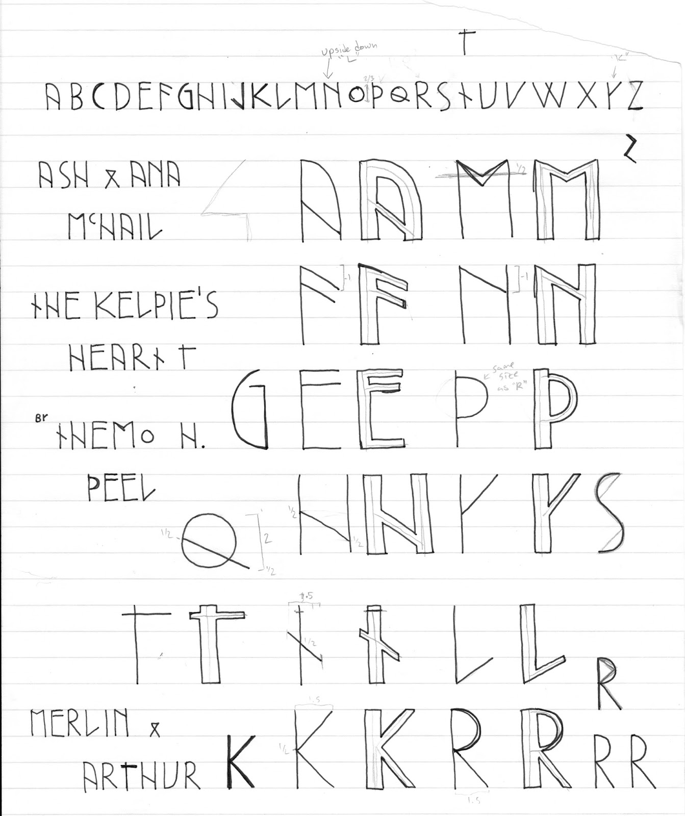
I wanted to a typeface that would be suitable for the book's subject - Celtic Magic.

Typography design takes lots of exploration. I spent a while exploring the form of Celtic runes and experimenting with creating a 'runic' sort of font. You want any book to have a memorable font. And, the greatest series, all have their own unique type-face that is identifiable at a glance. Think of Harry Potter, Marvel Comics and (I hate to say it) Twilight.

The thing about these fonts is they are all hand drawn which automatically makes them unique. It create something special when you know a font has been hand crafted specifically for that title.

The earliest version of the font
Early drafts came out looking a bit too literal. I've seen similar fonts and while stylistically their inspiration is very obvious, readability is poor. And, for any book, especially for young people, you want them to be able to read the title without any difficulty.

From these drafts I stripped back some of the 'rune' elements, primarily the unrelenting straight lines. Allowing the forms to curve made the text look less archaic. What came out I thought looked quite classy but was still a bit too modern.
Getting smoother
measuring out on graph paper
My first cover idea will feature Pictish filagree and figures as a frame. The letters need to stand out in an environment of intricate swoops and swirls without jarring against. So, while the sans-serif look is more true to the rune idea, it doesn't totally fit the aesthetic.


Themo H Peel - Chinese calligraphy
practice practice practice
I thought about different textures and how characters behave when writing on them. My first thought was of stone. The Pictish art that has survived the test of time is all stone carvings. I may still come back to the idea of stone in another cover draft. However, in this idea the illumination does all the heavy lifting and, after all, it is a book. I want it to have the feel of a modern illuminated manuscripts with distinctly Pictish flavour.

Themo H Peel - Kelpie's Heart
cover idea and lettering test
To achieve a more fluid looking font I broke out the old brush and ink set and practiced some Chinese calligraphy (of all things)! Chinese calligraphy dates back to 4000 BC and I thought adding some of the beauty and rigor of it to the very rigid font I designed would give it an edge of class and antiquity.

What it turned out was a more organic serif version of my initial ideas. While it's come a way from the blunt edged runes, the font maintains the odd runic proportions with sloped descenders and unique angles. I particularly like how the 45degree angles on the 'K' intersect with the vertical line in a way that cuts off part of the line thickness.

So, that's how I came to this cover idea's lettering. And you might have guessed the new title already! I'll do another post on how I came up with the new title later on and I'll post cover ideas as I start churning them out. The book is away to be proof read and I'm getting more feedback from a friend who's an editor. So, I'm fairly excited/nervous about this next phase of my publishing journey.

Themo H Peel - the Kelpie's Heart
testing out the lettering

I know that these ideas might all totally change when I have an agent. But, it's nice to keep my creative juices occupied while I'm on the look for that agent who will help me get to the next level!

Keep growing and keep going!


Buy 'Black Star' or 'Spirit Shear' on Amazon in the UK and US
Check out Themo on Twitter and Facebook

Thursday, 7 August 2014

Blossoming in Bristol

I recently developed a logo for the company Bristol Gardens, a fresh and stylish horticultural/landscaping business in, you guessed it, Bristol.

Bristol Gardens Logo - Themo H Peel
Bristol Gardens logo
It was a genuine pleasure to work with them. It's always nice when a client comes in with a clear and strong concept that I just help bring to the next level. It started off with the idea of paying visual homage to Bristol's shipping port history, but also, of course, gardening. Overall it needed to be professional yet a bit informal using the colours sage and slate grey.
They wanted there to be a hand-drawn quality to the logo. Design rule No 10: If you want something to look hand-drawn, draw it by hand! So, I sketched out the logo and when we decided on a concept I then carried it into illustrator and redrew it as a vector image. This allowed me to play with the bumps and jumps in the lines of the ring. I then paired the hand-drawn look with a classic font - Caslon - which is also a digital translation of something that was once hand done way back in the 1700s. I know modern post marks tend to use san-serif fonts for readability, but I wanted to firmly cement the look as 'old-school'. The whimsy of it all is in it's retro quality.
Using something as tactile and visually distinct as a postmark is  a recipe for great design. Giving the logo a hand-drawn feel made reference to the 'inkiness' of postmark. But I think it also lends itself to the idea of gardening and working with the earth. Clean lines are for slick corporate offices. You want someone down to earth and approachable who's going to get out there and literally get their hands dirty? Call these guys!

In the centre we used the Flower of Bristol - Lychnis chalcedonica (also known as Maltese Cross). Why? Well, because it's the flower of Bristol! Traditionally the flower is red but Bristol Gardens colours are sage and a slate grey. Also adding too many colours takes it away from the simple 'stamp and ink' feeling. My personal favourite part are the individual petals of the flower that are merged together as if the ink has pooled on the page. :)
Flower of Bristol - Lychnis chalcedonica
Flower of Bristol
Using the stamp idea was also an opportunity to represent the logo in two forms: One as a fully realised illustration where the plant grows into the 'postage rings'. Then another version that can be used as just that, a stamp (ya'll know how I love to make my mark). This is where it's always nice to collaborate with a client. I was just happy to have the petals in the centre but the client asked for the leaves to be integrated as if we were looking at a bouquet from the top down. I think it gives the circular version of the stamp it's own identity while still clearly belonging to the larger version. This will be particularly useful for things like social media and maybe even as a watermark for invoices.

Bristol Gardens Logo - Themo H Peel

Enjoy!


Buy 'Black Star' on Amazon in the UK and US
Check out Themo on Twitter and Facebook

Sunday, 3 February 2013

Infographic CV

To be honest, I'd never heard of an infographic CV until a mate asked me to create one for her.

It's not the most innovative but for someone who doesn't do stats, and for a first crack, it's pretty good.

The hardest part was converting a person, their skills and experiences into quantitative information. The trick, I found, was separating out the different types of information and creating separate 'charts' for each and tying them together. At the moment, they're only loosely hanging together through colour, but I'm sure given more time I could design something with a bit more of a coherent, overall theme.

Think I might have to make one for myself!

Enjoy!


Basic but pretty good first go.